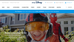
Disney has given their online shopping presence a refresh. Formerly disneystore.com, shopDisney.com has a new look.
The name change to the website is pretty recent, as is the new look. The design of the shopDisney.com website is similar to the design of disneysprings.com. Instead of having a list of the different categories, there are big tiles on the homepage with links to different categories.

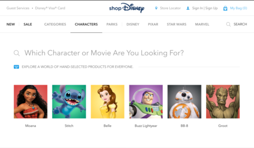
In addition to the tiles, along the top of the website are the different categories and you can get a preview of what is available when you hover over each category. Once you click on the category you will be brought to an extended list. The list for the “Characters” category is impressive. Disney has quite a few characters on the list.

Now for the important question, is it user friendly? In my opinion, yes. I don’t feel as though this new set up or design has diminished the user experience. While exploring the site, I was able to find things relatively easily and I like the way they list items now. They refreshed and cleaned up the website and it looks good!
The only thing is the website may feel a little plain to some people. I found it plain when I first saw it, but, let’s be honest, that’s not going to stop me from buying fun Disney stuff.
Have you checked out the new shopDisney.com? What do you think?
Thanks for reading!
*Liz*
Bonus Video
Check out some of the Halloween items you might find on shopDisney.com or the Shop Disney Parks app.
https://youtu.be/0YMmVCGfe-o
