I love Disney, all you have to do is glimpse at my website to know that, but I have never been very impressed with Disney’s online presence. I have always felt that for such a big company they really lack when it comes to details and ease of navigation. However, Disney just made things a little easier for those of us that use the ‘My Disney Experience’ app.
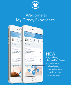
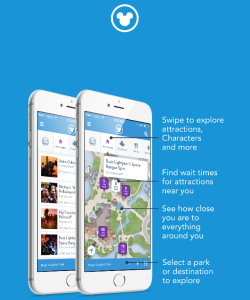
I played around with the app for a little while and found the improvements to be very helpful. What Disney has done is give you the ability to buy tickets, make FastPass+ selections, dining reservations, and plan activities right from the home screen. It’s pretty awesome, actually.
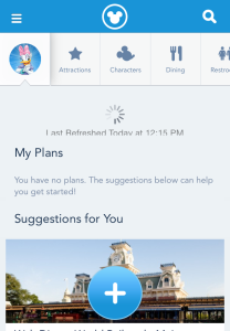
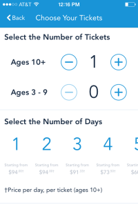
When you are on the home screen of ‘My Disney Experience’ you will see a symbol at the bottom that looks like a plus sign. Click on the plus sign to get the four different symbols for tickets, FastPass+, dining, and entertainment to pop up on the screen. It is a simple addition, but so helpful in making things easier to navigate around on the website. The ability to buy the tickets right from the app is fantastic and it has been integrated into the app very well. Plus, if you just want to price out the tickets this is a very easy way to do that.
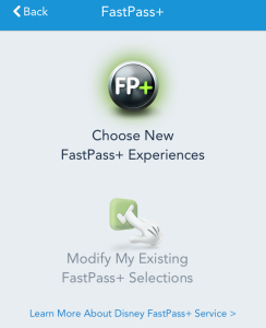
You can see the four different symbols are pretty clear for what they represent. So when you click on the FP+ symbol you will get the screen to reserve your FastPass+ selections, clicking on the ticket symbol will allow you to purchase tickets on your phone, the fork and knife brings you to the dining reservation screen, and the magic hat takes you to the screen where you can add entertainment plans. It is all very straight forward and easy to navigate.
The FastPass+ Screen
The Ticket Screen
The Dining Reservation Screen
The Extra Activity and Entertainment Screen
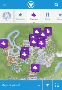
Across the top of the screen, on the same line as your character icon, you can swipe to see all the options that are available. This is a nice change too, it really does make it easier for guests to find things on the app. It’s all right there, so you don’t have to go searching.
You can see in the picture above that there are tabs to click on next to Daisy, those are what you swipe. With the tabs you will be able to find attraction wait times, character meet and greets, dining options near you, restrooms in the park, entertainment, events and tours, guest services, and shopping. They also still have the sidebar that you can click on for additional information and options, but a lot of what you need is now right at the top of the screen.
It’s fun to play around with the ‘My Disney Experience’ app and these changes are a welcome improvement. The whole experience feels a little smoother as you navigate around the app. So, if you have a ‘My Disney Experience’ account, you can play around with it now. If you don’t have an account I would recommend setting one up. This app is great and so helpful when you are planning your Disney and it’s helpful while you are on your Disney vacation. Plus, if you are missing Disney it’s fun to pull the app up and look at the park maps…not that I do that. Happy planning!
Thanks for reading!
Liz ⁰o⁰
[whohit]My Disney Experience[/whohit]
